
It was the summer of 2021 when George Fifield invited me to have a solo show at the Boston Cyber Arts Gallery. Boston Cyber Arts is a non-profit arts organization that promotes and facilitates various works, from experimental digital work to electronics and arts programming.
He had been following my work for over a decade and was no stranger to it. I met Mr. Fifield while he curated my work in the Art on the Marquee at the convention center while he was part of the Boston Arts Commission. What caught his attention this time was my unique perspective on civic design focused on data literacy through community engagement. What made it stand out, was the process that included the creation of the hardware, the gathering of the data, and the visualizing of this data to tell a story unique to the community.
The show was scheduled for fall 2022, which gave us time to focus on key areas, including Grant writing to finance the work, research on air quality, developing the sensors and building the prototype, and finally, identifying and contacting potential community partners.
The first step was the research portion focused on air quality. At Emerson College, I had been looking into Environmental Justice communities in Massachusetts, supported by student researchers, and Air quality stood out as one of the top candidates. I interviewed air quality experts, and respiratory issue advocates in Boston. There was already a body of work on outdoor air quality, but there needed to be more in the ability of communities to obtain, understand and act upon this data. There was also very little, if nothing, in the availability of indoor air quality among underserved communities.
The next step focused on learning how to create air quality sensors that could be easily built using inexpensive materials and easily recreated by communities affected by environmental justice. I wanted to focus on measuring several aspects of the air quality: Volatile Organic Compounds (VOC), small Particulate Matter (PM2.5), Humidity (H), Temperature (T), Ozone (O3), and Carbon Dioxide (CO2).


Simultaneously to this development, I also worked on finding the appropriate software for the community to visualize their data and create their own stories from their experience. It needed to be accessible, easy to use, and have the ability to export interactive presentations that could be used in the gallery space. The decision was made on Tableau, as it excelled in all of these categories.
The communities that I reached out to included ones in Chelsea and Boston and ranged from high school to university students. In the end, the chosen organization was Bottom Line, as they were the most committed, had access to Latine students from the target communities, and offered workspace for the workshops close to the gallery space.
By now, the idea had consolidated, and the prototype for the project was ready. Data para Todes was now ready to go live to help improve data literacy among Latine Communities. The main goal was to learn, collect, analyze, clean, and visualize data to create stories about environmental justice within the community. The first instance of the project happened through the collaboration with Bottom Line. Via workshops with first-generation Latine students held throughout the summer, we created individual working prototype sensors. The cohort learned about general electronics, soldering, and building prototypes. We learned about the specific sensors, their specifications, and their functions. From the maker’s perspective, they learned critical thinking, design collaboration, building prototypes, and how to fail/problem-solving.


The cohort from different colleges around Boston now proceeded to collect the data from their homes and dorms for several weeks. They were all first-generation Latine students and they wanted to center on their own stories. They worked to identify and solve errors in the sensors and the data. We worked on using Excel to clean up and organize the data so that it could be ready for visualization. Finally, they learned to use Tableau to bring everything together and create their stories.


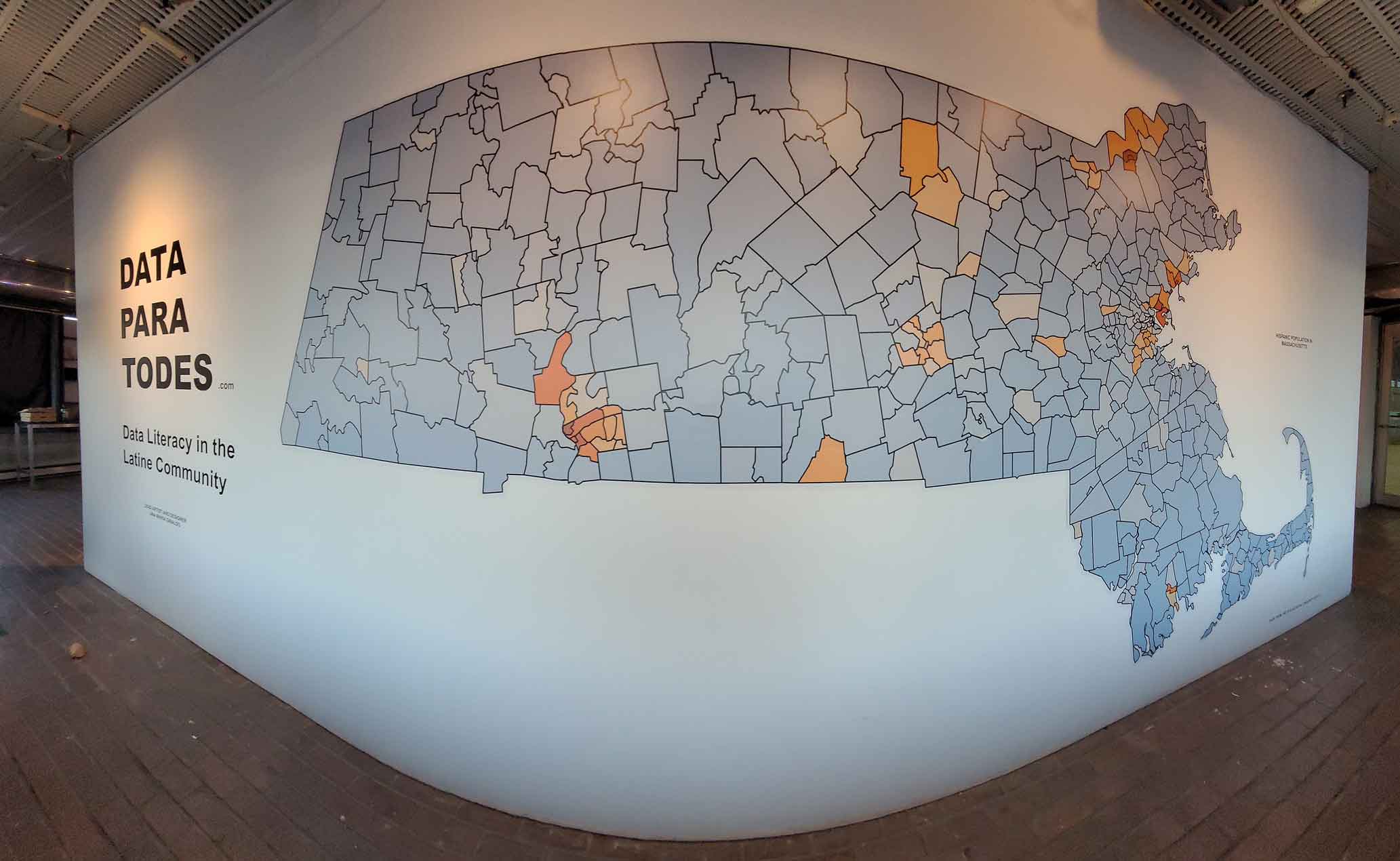
For the first piece, I created an 18 feet Map, where I analyzed demographics in Massachusetts of the Latine Community. As basic as this may seem, it was a shock that this map does not already exist and is available for public use. The next piece centered around income inequalities between the Latine population and other minorities, compared to the white population of the state.


The curriculum I designed effectively helped the students go from an idea to a story through a process of discovery, learning, exploring, and creating, all from their own experience and context. I created a methodology where the Latine Community could collect, through basic and affordable electronics, and tell stories of environmental justice within their community, challenging the existing data narrative. I cultivated a space for learning and creation that allowed me to build an exhibition based on the research, collection, and input of the entire cohort.
To complement the visual narrative, I created a twenty-five feet long installation of the data collected by the cohort, drawn with strings on nails. Each line represented data values, and each color was a fellow. The data presented were VOC, PM2.5, humidity, and temperature. The large size intends to use the wall as a canvas to confront the audience. I used the string and nails to bring the data out of the digital realm and create a tactile experience. Each line represents a data journey through two months. Each color string represented a value, each value had four different entries. I wanted to create an immersive experience where the audience is confronted by a line chart that visualizes the air you breathe daily. The goal is to ask the audience how the air changes depending on where you live, how close or far you are from the highways or industrialized areas, how many people live in your house, or how old and efficient your ventilation is.


I used the gallery space to narrate our own data stories, creating an immersive and physical visualization experience from data ownership to understanding what is already accessible. The data came from the US census report but had to be extracted, as there is no single view of the Latine community. The labeling used on the exhibition matched the categorization of the Census, which brought questions of misinformation and lack of visibility of the Latine population.
I used light bars to create the graphs and highlight the stark contrasts in the percentage of the population each community represents versus their share of the income. The led lights were designed to have a blue glow to create an intimate and welcoming atmosphere, contrasting with the harsh reality of inequality. The goal of these pieces was to understand the relationship between median income, accessibility, and environmental racism. A deeper understanding of historical segregation, miscategorization, and median income between races, is critical in understanding environmental racism.


The last pieces of the show focused on the work of some of the best cohort members. Each had a screen where they created an interactive visualization using Tableau. Here, they worked with the indoor air quality data collected at their homes and compared it with the outdoor air quality data from their neighborhood from commercially available purple air sensor data. I encouraged the students to explore and analyze the data and look for outliers and patterns. They also took photos from their neighborhoods and used them on interactive maps to personalize their narrative.
In order to humanize the data before the exhibition opened, I scheduled a photo shoot in the area where I photographed them. For the exhibition, I created silhouettes from the photos, printed them in life-size, and installed them next to their screens. This took the piece out of being just a technology and data visualization project and highlighted the person that was behind it.
Every member of the cohort has crafted a data story based on the data they gathered on indoor air quality. To enhance their findings, they also used open data sources, like “Purple Air,” to compare it with the outdoor data from their area. Additionally, they added pictures from the location to supplement their story. It was crucial to include their personal stories to humanize the numbers and give them a voice. We should strive to tell our stories and put a face to the data.


The main goal of moving outside the screen and creating a sensory experience is to humanize the data and make it come to life. We create data every day, from social media and wearables to smart cities. Even though most of us are being failed on the most basic rights of data equity, owning our data creates our stories and visualizes our challenges. By empowering the underrepresented Latine community with data literacy, we start to close the gap between those who control the data and make decisions and the communities that are affected by these decisions.
